Dropping the company name from your logo is always risky. One may lose their identity as a brand because of doing so. But there are few famous brands in the world who took that brave decision. They ditched their company name from their logo and still we can easily recognize them. In this article, we will explore 5 famous textless logos that are doing exceptionally well despite being wordless.
Brands With Famous Textless Logos
1. Apple
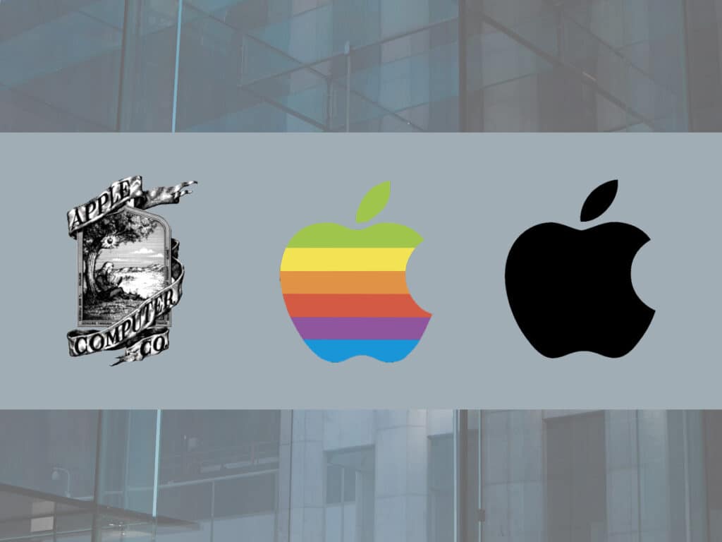
Apple is one of the world’s most valuable brands famous for its computers and modern gadgets. The brand adopted the woodcut style of illustration based on the famous and inspiring story of Isaac Newton as its first logo. But later on, the company replaced it with a bitten apple symbol created by Rob Janoff. That rainbow apple icon along with the company name was in use till 1984. After that, the company decided to ditch their company name from the logo. Since then they have been using this famous textless logo.
2. Instagram
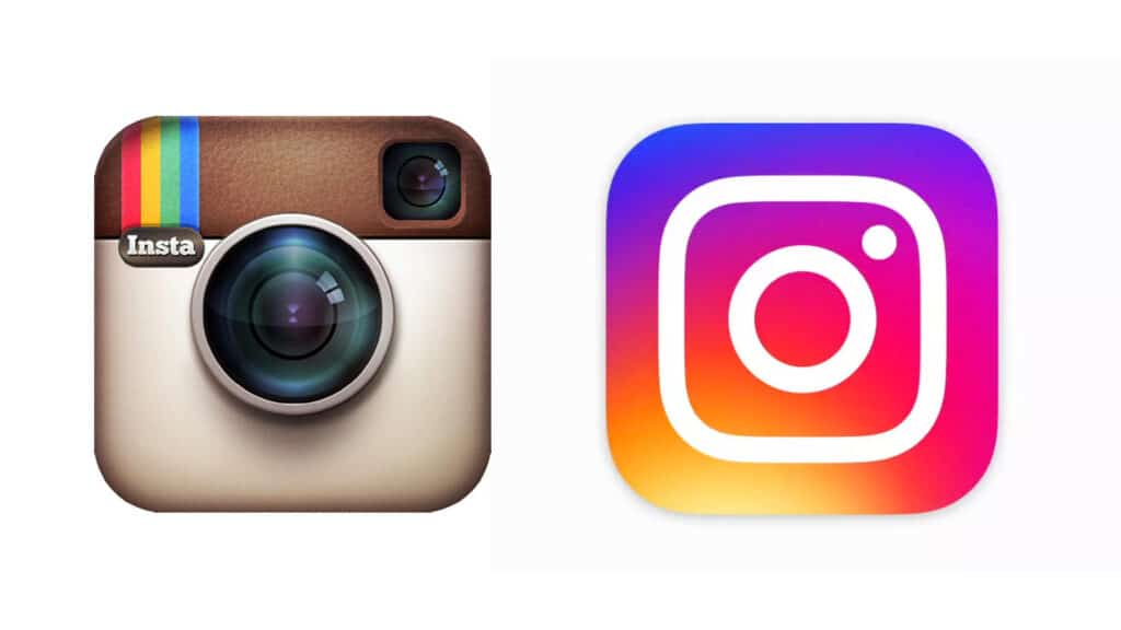
Instagram is one of the famous social media apps with millions of users worldwide. Though Instagram is relatively new in the market compared to other brands listed over here. Still, it has been able to manage its presence quite brilliantly as a social brand. Instagram replaced its initial analogue camera logo with a modern neon aesthetic. Instagram does not use any text in its logo design. Still, its wordless logo can be easily recognised by everyone.
3. McDonald’s

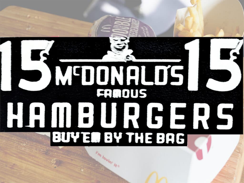
Who knows McDonald’s better than the food lovers? Mere mentioning their delicious food makes your mouth water. But do you know how McDonald’s famous logo has evolved? The Golden Arches made it to McDonald’s logo in 1961. Before that, they had been using heavy text logos with taglines like “McDonald’s Famous Barbecue” and “McDonald’s Famous Hamburgers”… Buy Em By The Bag.
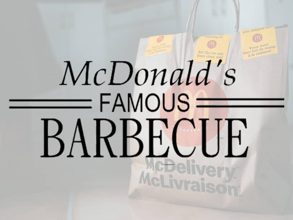
In 1968, the company name was added to the bottom of the golden arches. Later, a distinctive red background was also added to the logo in 1975 to make it look more attractive. After going through a few other subtle variations over the period of time, the company finally decided in 2006 to ditch its name from the logo. Since then the Golden Arches, making the shape of “M” become their trademark.
4. Nike
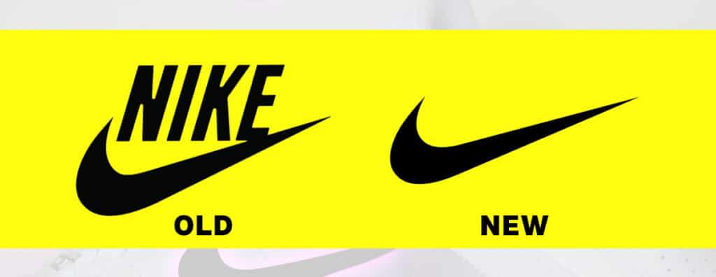
Nike is an American multinational corporation famous for its high quality footwear, apparel, and accessories. Their famous textless swoosh logo can be easily recognized by everyone today. Carolyn Davidson was the designer of this logo. She designed it in 1971 for just $35. Nike used to have its name attached with swoosh symbol till mid 90’s. But when the swoosh icon became so famous, they decided to ditch their company name from the logo.
5. Shell
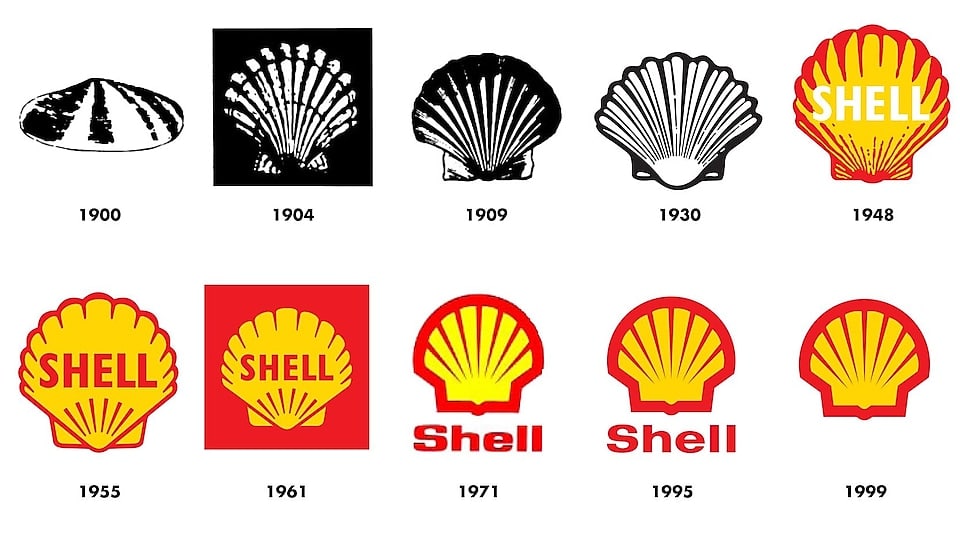
Shell is a multinational oil and gas company based in London, UK. In 1900, Shell adopted a realistically drawn scallop shell as their logo. That became more stylized over a period of time from 1900 to 1948. Later on, they incorporated yellow and red colors into their logo along with company name. By 1999, their symbol had become so much popular so they decided to take away their name from the logo.
