What is the difference between font vs typeface?
Have you ever questioned whether a font vs typeface is almost the same thing? Or, is font only a term used by intellectuals or historians? Maybe one is talking about analogue medium while the other is about digital? The straightforward response is that they indeed have different meanings. But, because the word “font” is so frequently used and misused, it hardly matters anymore (unless you are a type designer, in which case it does). Both typefaces and fonts are crucial elements in the realm of design. To create a constant brand reputation across a variety of mediums and platforms, businesses must define these phrases.
What is Font?

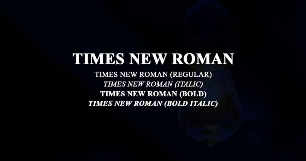
Fonts are the different sizes and weights of a particular typeface. A typeface contains a font as a component. For example, Times New Roman is a typeface that offers a full range of serif letters as well as a unified design philosophy. Even within the Times New Roman family, there are numerous “fonts”. The font is a single point size, weight, and width, as well as additional stylistic components such as the italic style.
What Is Typeface?

The presence and absence of a serif, the weight and proportion of the letters, the space between them, and the difference in height between uppercase and lowercase letters are all examples of design elements for the letters and other characters that make up a typeface. Typefaces are grouped according to their style. Serif typefaces, Sans Serif Type Faces, and Decorative and Script typefaces are a few of the most popular types of typefaces.
SERIF TYPEFACES:
As the name suggests, serif typefaces are typefaces with serifs. Serifs fonts and typefaces typically have a refined, vintage vibe. These typefaces are often not recommended for body text because they might be obtrusive as well as challenging to read. Serif typefaces have a rich history that spans several centuries. Nicolas Jensen created Roman, one of the first types used in the western world, in 1970 to make text simpler to read.
SANS SERIF TYPEFACES:
Sans serif typefaces are those without serifs. There are several types of sans-serif typefaces. Like geometric sans serif, humanist sans serif, grotesque sans serif, and neo-grotesque sans serif. Common examples of these are Futura, Frutiger, Franklin Gothic, Helvetica etc.
DECORATIVE TYPEFACES:
When compared to typical serif and sans serif typefaces, decorative types are more interesting, and eye-catching, and appear a little more specialized. Morris troy and Outlaw are the two most popular ornamental typefaces. Although a decorative typeface can be a wonderful attention grabber for your headline or outdoor banner, readers may not appreciate it when it appears on a menu or in a flyer.
SCRIPT TYPEFACES:
Script typefaces mimic the appearance of cursive writing. Using a script typeface can be a terrific approach to convey the handcrafted and unique nature of your company.
Font Vs Typeface Debate
The debate over font vs. typeface illustrates how professional language can evolve while still upsetting people if employed unconventionally. Nowadays, the terms “font vs typeface” are frequently used synonymously. And most of the time, that’s perfectly good. There is no misunderstanding because everyone understands what is being discussed. But in reality, there is a distinction between a font and a typeface, and doing so could result in embarrassment.
Font vs Typeface – What is the difference and does it matter or not?
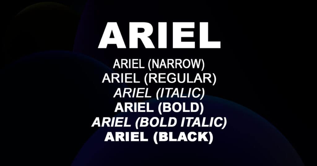
The primary distinction between a font and a typeface is that the former is the component of the latter. Let’s use an illustration to further clarify that. Helvetica will do. Helvetica, which is frequently referred to as a “font”, is technically a typeface. It is a full collection of sans-serif letters that have a similar design philosophy. The typeface, however, also consists of a variety of fonts, each having a unique weight, style, and size, as well as various degrees of condensation and italic variations. One element of the confusion is the fact that Helvetica can be chosen from the font option after being downloaded on your device.
Over time, the term “font” has become more prevalent. Nowadays “font” and “type” are frequently used interchangeably, and both usages are acceptable. The difference between these two names is, in fact, now unclear, unnecessary, and even a little out-of-date. Therefore, one can contend that in most situations, understanding the distinction is meaningless.
It’s crucial to note that it can be important in some situations. Understanding the distinction is important not only for type design but also for product development, product engineering, and even web design. When discussing a modification to a specific typeface without altering the surroundings or display as a whole, it can be helpful to be more specific. It all comes down to properly applying fonts and typefaces and streamlining the process.
A Brief History of Font vs Typeface
The terms “typeface” and “fonts” were far less puzzling before computers due to the era’s technology, which made it simple to realize how fundamentally dissimilar they were. Printers were not digital devices in the past. The persons who actively lay out sentences, phrases and words were known as typesetters and printers. They did this by using “type”, which are actual letters and other symbols that are placed on printed pages.
The type had been sorted and kept in job cases and had numerous chambers, where the type was kept. There were gaps in letters, numerals, and every type of punctuation you could think of. Despite being a component of the same typeface, each font was given its work case since each one had a distinctive look, including width, optical size, weight, size, grade, and effect.
Also read: Five Best Free Fonts
Modern Style Typefaces
The “modern style” typefaces contain extremely sharp contrast between the strokes and very tiny serifs. The traditional and intermediate designs of typography were attacked and rejected by the creation of modern-style typefaces. Typographers became tired of typefaces inspired by handwriting and wished for something more modern and cleaner. Firmin Didot and Giambattista Bodoni were the pioneers of the contemporary typographic style.
Variable Typefaces
Before a new option known as variable fonts was added in 2016, a digital typeface family comprised different font documents for each weight and style. Variable fonts allow for limitless stylistic alterations because they include the full font family in a single document. Before then, you could alter the fonts, but doing so required using a different font file and switching out individual letters. Variable typefaces are ultimately a response to the complex world we live in today.
Combine Typefaces
Although we all adore our typefaces, there may be a negative side to everything. Too many diverse typefaces can create a cluttered, chaotic appearance in a design. Though this rule can be ignored to great effect in the appropriate situation, it is generally safe to stick to using no more than three different fonts in one typeface.
If you are searching for a place to start fusing typefaces, a basic sans-serif font and a serif font will nearly always go well together. Another choice is to select a single typeface or type family that has a range of weights and styles; this will make your type look unified while still providing you with a variety of options.
Font Pairing Resources
One of the most challenging and underappreciated design chores is font pairing. Not only graphic designers must be concerned about it. You should be concerned with font pairing if you are creating a PowerPoint presentation or drawing up a contract to send to a client. Fonts have the power to grab attention, evoke feelings, and even rank among the most crucial. That’s why the fonts you select should work well together because they have such a big impact. The general idea is to pair no more than three fonts for your project.
It can take a lot of effort to pair the right fonts together, and it’s impossible to recall every potential combination. Fortunately, we have the internet. A typography internet tool called Font Pair offers pairs to designers as assistance and inspiration. You can navigate through their featured pairs or select a different font type to narrow your search. Designers that have used certain font combinations have offered them to typespiration.
On the website Typ.io, users can explore some of the most popular landing pages, also what goes on behind the scenes, such as font selection and placement decisions made by the designers.
The Future | Font vs Typeface
Every possible product, feeling, or situation is represented by a typeface design, and then some. However, even though there are countless typefaces on the market today, the field of typography is always in need of new ideas. The way we produce, design, and interact with type has changed significantly throughout the centuries, starting with the invention of the Gutenberg printing press in the 15th century, and continuing through the development of desktop computers and today’s profusion of media and gadgets. In short, we are expecting a lot of beautiful fonts in near future.
