What is Minimal or Minimalist Design?
A Minimalist design is a design capable of conveying a message without using too much of elements, colours, shapes, and textures. The minimalist design embodies the phrase “less is more”. This is a quotation by legendary German architect Mies Van Der Rohe. He was one of the notable architects in Europe and the U.S. in the post-war era. His work greatly influenced the very path of minimal or minimalist design.
Different aspects of Minimalist Design
Let me start by saying, I don’t think or believe there is only one way to design something. That’s a pretty narrow-minded approach but what many people consider to be minimal design is actually something else. Trying to be minimal just for the sake of fitting a trend, a lot of graphic designers often confuse the concept and background of minimal graphic design.
Today we’re going to see exactly why, when most people think of minimal design, they instantly think of design with a lot of white space. Maybe a single small paragraph of text in the corner with minimal logos.
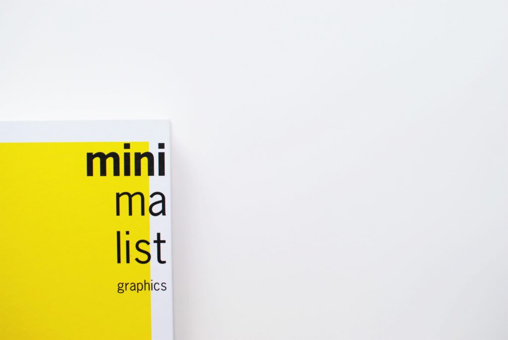
They think of a single geometric shape or a line logo. The truth is that yes some of those logos might be minimal however their thought process is all wrong. Actual minimal design has a purpose and relevancy. And minimal design might even use many colours.
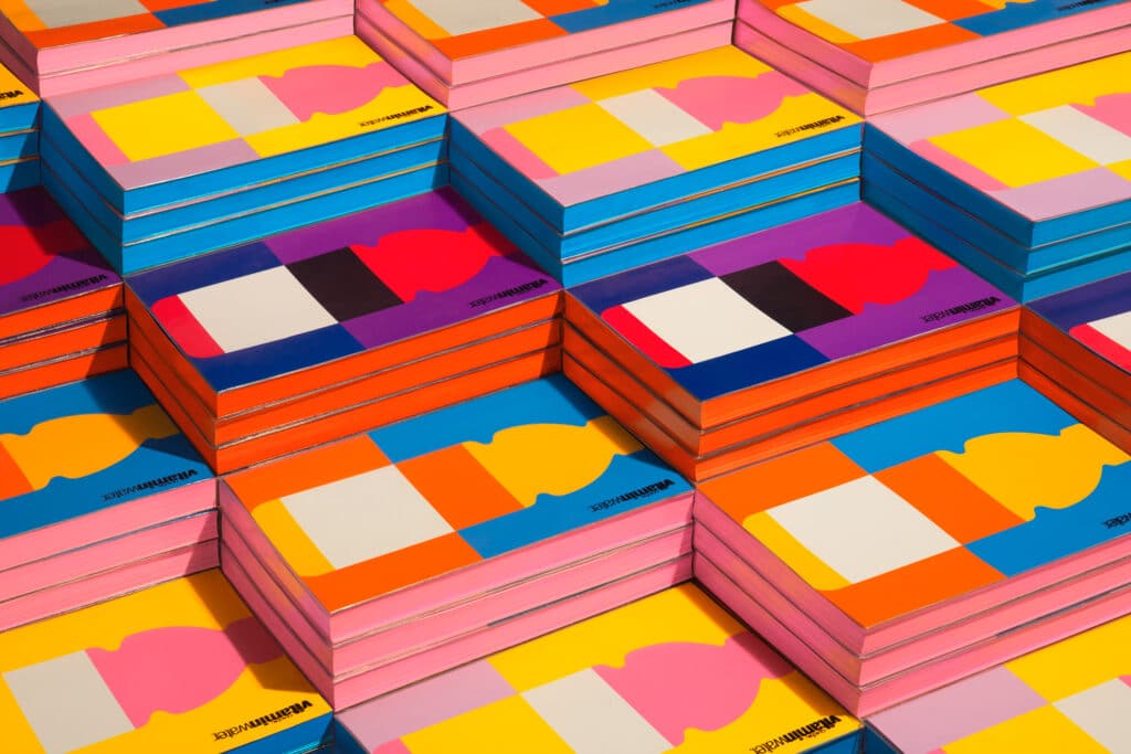
Like with the branding project for vitamin water by the collins design agency. The brief outline for this project stated that the simple side of vitamin water should be kept in the message behind the brand identity. And they wanted the product to be easily recognized on the shelves. This is the key importance of minimal design. It’s all about function.
Let’s take a look at some of the aspects of minimal design. There are three at the very core. They are that a message or a function must drive the design. The second is the designer is going to remove any clutter that distracts the viewer from engaging with the content and overall message of the design. And finally that each design element serves a purpose to achieve the final goal.
Let’s break these down one by one with some examples.
RULE #1
So the first rule is that the message you want to deliver to the audience should guide a design. This example of muse and meta illustrates that perfectly. The branding and package design reinforce the brand as minimal in nature but that’s only because it helps deliver the brand’s message.
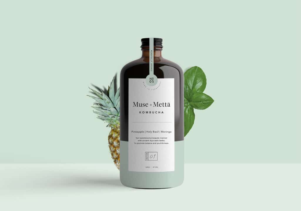
kombucha is a healthy choice to drink and with health comes the notion or the idea of cleanliness purity and so on. Having a minimal design drives the idea to the consumer with heavy use of white space and muted pastel colours. This isn’t a minimal design for the sake of being minimal. It has the purpose of driving a story to the viewer which they can then buy into.
Rule #2
The second rule of true minimal design is that things shouldn’t be cluttered. Minimal design is all about function and sending a message to the audience in the most efficient way possible. It isn’t meant to be about looking trendy or to look cool. It has a purpose or it should have a purpose. If the design is cluttered, the message is not going to be delivered as effectively. So this design for tinker demonstrates that perfectly as they have the “back in stock” text and then some brief information below nothing more.
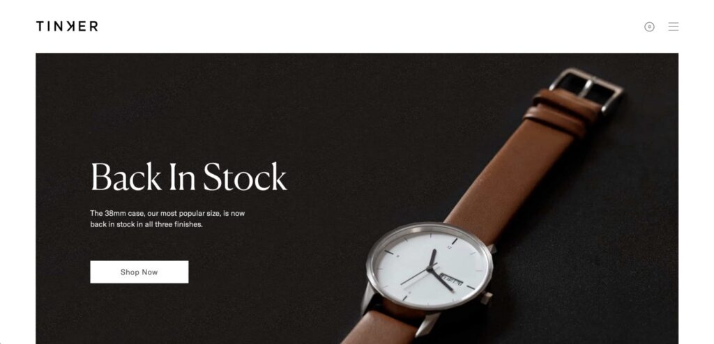
This is all that needs to be delivered to the audience and thus we have a minimalist design. Yes, the fonts are chosen carefully. There is a hierarchy as well. But remember, in removing clutter we do end up with lots of white space usually. It’s not that minimal design tries to have lots of white space. It’s just that by removing excess unwanted elements we have white space remaining. But also white space does help the viewer to latch on to the key areas of interest.
Rule #3
The third rule that we spoke about was that every design element needs to have a purpose in a minimal design. True minimal design isn’t minimal for the sake of being labelled as minimal. It becomes that way simply by the virtue of wanting to deliver a message. A prime example here would be the apple iPod adverts.

The silhouette represents the consumer viewing the advert. The iPod is the product that the consumer wants. The logo enforces a brand’s influence and presence. And then crucially the background is the main point of attraction that brings in the viewers in the first place because it’s really bright bold, and colourful. Every element is useful and every element has a purpose.
These three rules are what makes up true minimal graphic design. It is what it is and it’s not a fake minimalist design that is attempting to look a certain way for aesthetics alone. This way of designing is very useful, especially in branding. But, of course, it isn’t going to be necessary for every single situation or project. It’s just a tool, and like with any tool you shouldn’t become emotionally attached to it or emotionally angered by it.
Principles for creating a minimalist design
Do you want to unlock the secrets and the golden rules for quality minimal or minimalist design? Here we will talk about some of the basic points that we need to be in mind while creating a minimal design.
1. Imagery
One of the things that many designers forget about or even ditch when working with minimal projects is imagery content. Now when people think of minimalist design, they often think of wide-open spaces which in part is pretty true but the use of imagery in a well-thought-out manner is highly effective.
Now, of course not every minimal design is going to use imagery but it is a great choice. It can act as a focal point or a balance either symmetrically or asymmetrically.
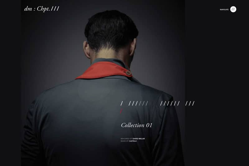
When picking imagery for your designs, look for photos that feel simple and easygoing. Experiment with the imagery actually being in the background or maybe with low opacity or even a blend mode.
2. Fonts
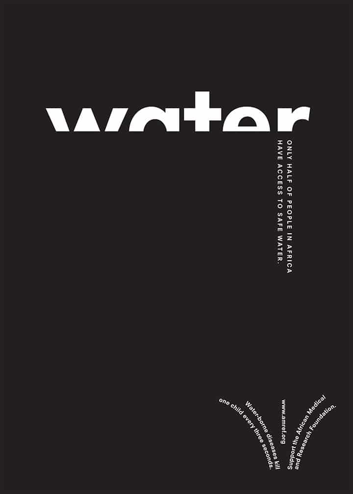
Font selection is vastly important for a minimalist design. That’s because, in minimal design, there are not many design elements competing for attention. So a minimal design needs to feature clean and readable typography to be most effective.
The trick here is to develop a font palate with one or two font families. Then create some hierarchy between them essentially contrasting and font pairing. Because there is so little in the way of design elements. Don’t be afraid to play with the main attention-grabbing text editing it and seeing what creative twists.
You can apply it all while making sure it’s still legible in minimal design. The typography can be used as the focal point if done correctly. Remember, typography is a key element in minimal graphic design. Thus we should treat it with the utmost care more so than usual.
3. Colors
Your choice of colours in a minimal design should be as simple as a typography selection. Black on white can be your base colours and you’re gonna argue black or white. But black and white don’t have to be the only colours that you choose for your scheme.
Some designers do fall into that trap. They also try to pick one colour to draw the design forward that matches the message and also the theme of the design. You can also consider maybe using colours to act as a focal point in some way as you can see here with the red circle. The driving colour of your choice can be bright or light. And it can serve as anything from a background texture to even an accent.
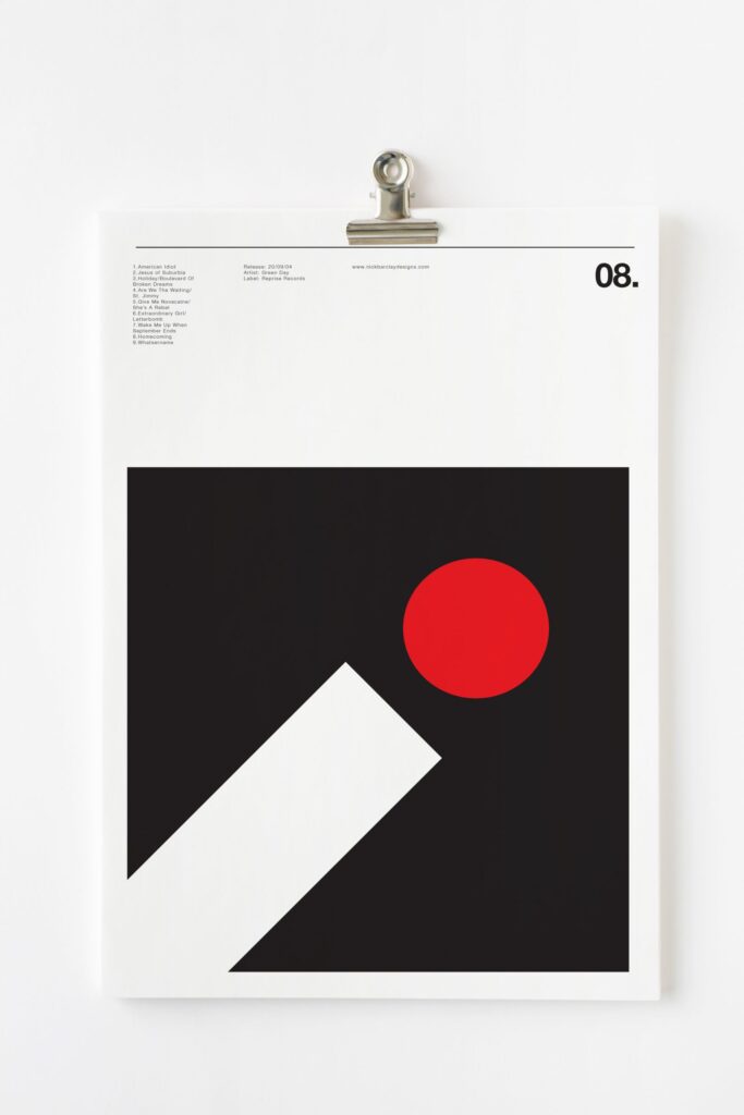
Think about the key message of the design. As, what is the overall feeling in the mood. The colour choice is going to reflect the message and the mood. It also should complement a typeface style too. Now a quick tip for using colour on a minimal design is to use high contrast. So use colours that are obviously very different and stark when set against each other.
4. No Clutter
Cleaning out the closet of your minimal graphic design is really important after all it is a minimal design. So it basically needs the bare essentials and also it needs to be practical as well as visually appealing. Think about each element individually. Does it serve a purpose that’s going to create a better journey for the user, or is it just pure decoration?
If the answer is pure decoration, then you might want to rethink whether or not the element should be part of your design. Minimal design is refined down to the key essentials and it uses those essentials as artistic attention grabbers.

5. Balance
Now finally one key Golden Rule for minimal design is balance. For every bold or heavy element on your design, look for a way to balance it with shape space or light elements to establish harmony in the overall design.

Many minimal graphic design projects can be text-heavy leaving some really dominating elements and spaces. Establishing a counterbalance to that weight is important to keep the design from feeling lopsided boy overwhelming.
What are your thoughts on the minimalist design? Share it in the comments below.
